As an Amazon Associate, I earn from qualifying purchases
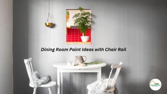
Choosing the right paint colors for your dining room can have a significant impact on the overall ambiance and style of the space. When you have a chair rail in your dining room, it offers a unique opportunity to create a visually appealing look by using different paint colors for the upper and lower portions of the wall. In this article, we will explore various Dining Room Paint Ideas with Chair Rail specifically curated to complement and elevate the decor of your dining area.
Classic Elegance: Neutral Tones
If you gravitate towards a timeless and sophisticated aesthetic, neutrals are your go-to palette. Consider using crisp whites, soft beiges, or gentle greys to evoke a sense of calm and simplicity. These shades pair well with the wood tones of dining sets and can make your space feel larger and more open. Remember that neutral doesn’t mean boring by incorporating different textures and layers within your paint choice and decor, you add subtle interest that never goes out of style.
In addition to using soothing neutrals as your base, incorporating metallic accents or a feature wall can add a personal touch without overwhelming the space. Metallic accents, such as gold or bronze, can be introduced through light fixtures, picture frames, or as part of the chair rail itself. A feature wall using a bolder color or textured wallpaper acts as a focal point, enabling you to keep the rest of the room in neutral tones while still achieving visual interest.
Bold and Beautiful: Jewel Tones
Making use of jewel tones can transform your dining space into an area of luxury and comfort. Emerald green or sapphire blue below the chair rail paired with a muted upper wall can introduce a regal ambiance. These vibrant, saturated colors can also reflect light differently throughout the day, offering an evolving look from sunrise to sunset. Opt for these sophisticated hues to provide an essence of grandeur to dinner parties or quiet family meals.
Moreover, adding a hint of gold or silver to detailing like stenciling or even chair rail edges enhances the luxe effect of jewel tones. It’s fascinating how indirect sunlight or artificial light reflects off these metallic accents, creating a dynamic ambiance as it shifts throughout the day. Bear in mind to balance the visual weight; a large and bold lower wall color needs a counteracting neutral shade above to prevent heaviness. Give these decorative techniques a try to achieve a dining room that exudes sophistication and grace.
Timeless Tradition: Classic White – Dining Room Paint Ideas with Chair Rail
Classic white has quite the pedigree in interior design, effortlessly connoting a sense of class and cleanliness. Whether utilized as a sharp contrast to darker colors beneath the rail or as a soft complement to pastel tones, white remains an eternally favored choice. When paired with a chair rail, it can provide a crisp division while also meshing seamlessly with any era of décor from modern minimalism to the intricate stylings of Victorian-inspired themes.
Using white allows for versatility in accenting with bolder colors or patterns in your furniture and accessories. It opens up a spectrum of possibilities for seasonal decorations or changing styles without having to repaint. Additionally, white can act as a brightening agent in rooms that might lack ample natural light, giving the illusion of a more spacious and airy dining area. The universal appeal of classic white ensures that your dining room remains sophisticated and adaptable to various furnishing choices.
Modern Chic: Monochromatic Scheme
When using a chair rail for a sleek, cutting-edge design, a monochromatic palette is particularly effective. Imagine a slate grey or whisper-light blue, used in gradient dark-to-light starting from the chair rail down to the baseboards. The distinction gives the walls a rooted feel while simultaneously allowing the ceiling to seem more expansive. It’s a modest approach but holds undeniable modern elegance, offering a canvas for various styles of furniture and decorative pieces to really shine within the room.
Your accessories and furnishings play a vital role in complementing this modern chic approach. Opt for sleek, minimalist furniture that aligns with the understated elegance of your wall scheme. To enhance this setting even more, consider incorporating a statement lighting fixture or a piece of bold artwork, which will stand out against the monochromatic backdrop without disrupting the room’s cohesive aesthetic. Such elements will help create a dynamic yet harmonious dining experience for you and your guests.
Nature’s Embrace: Earthy Tones
Incorporating earthy tones creates a warm and natural ambiance. Consider olive, terracotta, or soft browns below the chair rail, paired with a muted beige or ivory above. These colors reflect the organic beauty of the outdoors and bring a comforting vibe to your dining space. Enhance the natural feel further with natural wood furnishings. Earth tones work exceptionally well in spaces with ample sunlight, making your dining room feel like a cozy retreat.
To add to the natural theme and refine the aesthetics, include accessories that complement the earthy palette. For example, a centerpiece of fresh greenery or a rustic wood fruit bowl could accentuate the space’s connection to nature. Soft, neutral-colored textiles for curtains or dining chair cushions can weave comfort into the ambiance, completing the picture of a dining room that not only looks great but also feels full of life and organic charm.
Trendy and Playful: Pastel Hues
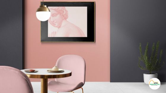
Pastels are making a comeback and offer a light-hearted touch to dining areas that aim to be inviting yet casually stylish. Try pairing a pastel yellow or blush pink below the chair rail with a crisp, contrasting white above. This approach not only brightens the room but also enlivens it with a subtle dash of color. Keep the chair rail itself a neutral shade to balance the overall palette and maintain a sophisticated border between the two hues.
Integrating pastels allows for a gentle color pop without overwhelming with bright shades. These softer tones can nicely offset the sharp lines of the chair rail, providing an unexpected yet cohesive design feature in a more contemporary setting. For a coordinated look, consider using decorative elements or accessories within the room that echo the pastel hue, such as cushion covers, vases, or artworks, to further enhance the visual flow from the chair rail to the overall room aesthetic.
Regal Affair: Deep Reds
Deep reds offer a sense of luxury and can make your dining area feel like a high end destination. Imagine a sumptuous merlot or a rich mahogany painted below the chair rail, meshed with a softer, perhaps beige or cream hue above. Such a palette can create an inviting warmth, encouraging long, leisurely meals. Be mindful of lighting, as it can influence the way these bold colors are perceived soft yellow or warm white tones can make red walls look even more vibrant.
When using deep reds, it’s essential to ensure adequate lighting to bring out the true richness of the color spectrum in dim light, the reds can appear muted or dulled. Complement this royal scheme with warm incandescent or LED bulbs to accentuate those luxurious undertones. Also, consider adding gold or brass elements, such as picture frames or light fixtures, to complement the reds and add an extra layer of sophistication to your dining room ambiance.
Coastal Vibes: Ocean Blues
Introduce a coastal atmosphere by incorporating various shades of blue, reminiscent of the sea and sky. Lighter blues above the rail can represent the openness of the sky, while darker ocean blues below suggest depth and groundedness. Accents like seafoam green or sandy beige on the chair rail or trim can pull the beach-inspired palette together, creating a serene environment perfect for a relaxed dining experience. This palette invites a breezy, maritime charm into your home.
Layering these coastal shades with accessories can amplify the effect think of adding decorative shells or beach-themed artwork that echo your chosen hues. By doing so, you craft a cohesive aesthetic narrative throughout the scene. The lighter tones both above and below the chair rail can soften bright sunlight during the day, while the reference to maritime colors brings a calm ambiance to evening meals. Appropriately chosen lighting fixtures can also serve to enhance the coastal atmosphere, casting a soft glow that mimics the setting sun’s reflection over the ocean.
Rustic Charm: Weathered Greens and Greys
If you desire a dining room atmosphere that feels relaxed and naturally elegant, consider a rustic palette. Soft olive or sage greens paired with weathered grey can evoke the essence of a countryside retreat. Painting the area below the chair rail in a muted green and using the grey above can merge the traditional with a modern twist. These understated tones not only create a serene environment but also allow room for bold accent pieces to stand out.
To further enhance the rustic vibe, consider incorporating natural textures into the design. This could include adding a reclaimed wood dining table or wicker chairs that complement the earthy tones of green and grey. Textured linens and a centerpiece featuring wildflowers can also contribute to the casual yet sophisticated country charm. Emphasizing a connection with nature through these design choices can transform your dining space into a cozy gathering spot for family and friends.
Sunny Delight: Warm Yellows
Using warm yellows is a perfect way to infuse your dining room with a sense of cheerfulness and energy. Consider a buttery yellow beneath the chair rail and a pale, sunlight-inspired hue above to create a sunny ambiance. Pay attention to the room’s natural lighting when working with warm colors to ensure they complement the space during all times of the day. Soft yellow tones can make morning meals feel even more inviting and dinners more cozy.
To maximize the advantages of warm yellows, consider the interplay of light fixtures and bulbs that cast a similar glow. Experiment balancing natural daylight with soft, warm artificial lighting to maintain the room’s mood from day to night. Furthermore, adding decorative elements like candles in complementary colors or subtle golden accents can bring out the richness of the yellow tones and elevate the entire dining experience. It’s all about creating a welcoming and vibrant atmosphere that feels like a constant sunrise.
Glamorous Glamour: Metallic Accents
Introducing metallic accents can elevate the space spectacularly. Consider using gold, silver, or bronze paint to highlight the chair rail or to create a shimmering feature stripe where the wall meets the ceiling. These gilded touches add a layer of opulence and can reflect light in enchanting ways. Implementing metallic paint with stencils or subtle glazing techniques will produce a distinctive and luxurious ambiance, beautifully complementing other wall colors and providing a conversation starter for your guests.
In addition to a purely metallic look, metallic paints are also useful for creating highlights along moldings to define lines and shapes within the dining area. Texturing these metal-toned highlights can impart another layer of visual interest. One could also echo the brilliance of these metals in accessories like light fixtures or tableware for continuity. Carefully placed mirrors can further exploit the play of light, embellishing the sparkle and elevating the room’s sophistication.
Contemporary Contrast: Black and White
For a modern and striking aesthetic, leverage the contrast of black and white. Painting the area below the chair rail in a sleek black while keeping the upper portion crisp white can create a powerful statement. This color scheme is not only timeless but also offers flexibility in decor options, allowing for bold or subdued accents to be interchangeably integrated. The dramatic divide visually anchors furniture while the two-toned wall demarcates spatial boundaries with sophistication and simplicity.
This approach is versatile, easily paired with either minimalist or eclectic stylistic choices. Consider the reflective surfaces or lighting to play off the stark black-and-white architecture, further enhancing the space’s modern feel. Accents in metallic tones or bursts of color in art and textiles can break up the monochromatism while maintaining the elegant simplicity established by the dual-tone backdrop. To maintain a sense of unity, select decor items that echo the room’s two primary hues.
Elegant Enigma: Deep Purples
For those wishing to imbue their dining room with a sense of dramatic flair and opulence, deep purples can be the perfect choice. The rich, luxe tones of eggplant or plum below the chair rail can become a luxurious backdrop that is both warm and inviting. Coordinating this with a lighter lavender or pale gray above can keep the room feeling airy. Remember, dark hues below the rail will draw attention and make a bold statement.
Pairing a luxurious purple with cool-toned accents or metallic embellishments can elevate the richness of the wall colors even more. Consider using silver or brushed nickel for light fixtures and hardware to add sophistication. Accessorizing with complementary colors in your curtains and table linens can also bring the whole look together. This addition can support a modern or classic aesthetic, depending on your choices and the lighting within the room, which plays a key role in highlighting the color depth.
Chic Simplicity: Soft Greys
For those seeking modern elegance, grey tones stand as a timeless choice. Lighter greys above the chair rail can expand a room’s perceived space, conveying a serene atmosphere. Consider a charcoal grey below for a solid grounding effect. Pairing grey with textured fabrics in the dining room creates a layered sophistication. To prevent it from feeling too cold, introduce pops of color through decor such as vibrant vases, warm wood tones, or a bold-patterned area rug.
Transcendent Tranquility: Mint Green
Imagine walking into your dining room and being greeted by the soothing tones of mint green. This color projects a sense of calm and freshness that can instantly make the space feel more inviting. To create a serene ambiance, paint the lower portion of the walls with a deeper shade of mint, adding texture and depth to the room’s dynamic. The upper walls, coated in a lighter mint, would then reflect more light and contribute to a relaxed, airy atmosphere.
Pairing the mint green with white or soft beige on the trim can elevate this tranquil palette, creating a pristine border that encapsulates the walls. Using a semi-gloss finish on the trim allows for a subtle play of light that works wonders with the matt-finished mint. Furthermore, adding ornamental touches like classic paintings with natural themes or a vase of fresh flowers on the table can accentuate the calming environment you’ve set out to achieve.
Classic Two-Tone Elegance
Using a classic two-tone color scheme in your dining room creates an effortlessly elegant vibe that’s both timeless and sophisticated. Opting for a darker tone below the chair rail can lend a sense of stability and formality, while a lighter hue above can make the room feel more spacious. When you apply this technique, you also get the added benefit of having an easier time choosing decor, as the natural transition between colors acts as a built-in guide for placing artwork and decorative elements.
Subtle Neutrals with Texture
Using a classic two-tone color scheme in your dining room creates an effortlessly elegant vibe that’s both timeless and sophisticated. Opting for a darker tone below the chair rail can lend a sense of stability and formality, while a lighter hue above can make the room feel more spacious. When you apply this technique, you also get the added benefit of having an easier time choosing decor, as the natural transition between colors acts as a built-in guide for placing artwork and decorative elements.
To enhance the sophisticated two-tone design even further, consider incorporating chair rail moulding with more intricate detail. This extra element of intricacy can elevate the sense of elegance within your dining room. In addition, choosing wall decor that subtly echoes the lower wall color can further draw the eye and integrate the dual tones of your walls. By balancing the two shades and employing strategic decorations, you can create a dining space that feels both cohesive and gracefully distinguished.
Bold Accent Wall – Dining Room Paint Ideas with Chair Rail
Even without adding a different color below the chair rail, you can create a bold accent wall that defines the dining room. This technique draws attention to a particular area, and by using your chair rail, you can enhance this feature. Choose a wall where artwork or your best furniture pieces will be showcased, paint it a standout color, and keep the other walls more neutral to allow your accent wall to truly make a statement.
Selecting an eye-catching paint for your focal wall can also influence the atmosphere of your dining room. A rich emerald green or a dramatic charcoal can produce a stunning effect, especially when lit with directed warm lighting such as wall sconces or track lighting that can accentuate these colors. Be sure to balance the accentuated wall with the rest of the room by employing decorative elements or artwork that can harmonize with the chosen theme and chair rail division.
Monochromatic Harmony – Dining Room Paint Ideas with Chair Rail
Opting for a monochromatic palette doesn’t equate to a lack of creativity or design depth. On the contrary, selecting varying shades from the same color family allows you to play with light and shadow, subtly defining different areas of the room. A dark trim works exceptionally well with this approach, bringing a defined edge to the room’s aesthetic. Remember, the goal is to create a space that stands out while remaining harmonious and balanced.
In a room rooted in monochromatic design, the subtle interplay between shades can be elevated further with strategic lighting choices. Consider how natural light or fixture placement highlights the paint choices and accentuates the curves or lines of the chair rail. Thoughtful illumination can reinforce the mood you’re seeking—whether that’s a bright, sociable space for dinner parties or a more subdued ambiance for intimate gatherings. Deliberate lighting can shift the perception of colors and alter the room’s atmosphere entirely.
Wainscoting Charm – Dining Room Paint Ideas with Chair Rail
Wainscoting brings a vintage or sophisticated elegance to your dining room, especially when painted in a lighter tone that contrasts with rich, dark colors above. This not only draws the eyes upwards, making the room appear taller, but also adds depth and interest to the space. When styling your dining room with wainscoting, consider a semi-gloss finish for easy cleaning and a bit of shine that reflects light beautifully, offering both practicality and aesthetic appeal.
Wainscoting also creates an ideal backdrop for displaying artwork or hanging mirrors, which can make spaces feel larger and more dynamic. Choose art that complements the color scheme and adds visual interest without overpowering the room. Mirrors, particularly with ornate frames, can serve as a functional decoration while enhancing the ample light within the space. Whatever your personal style, incorporating these elements with your wainscoting can seamlessly elevate the sophistication and charm of your dining room ambiance.
Earthy Tones for a Rustic Feel
To achieve a rustic ambiance in your dining room, consider earthy tones like terracotta, warm beiges, and subdued greens. These colors can both harmonize with natural elements and lend a comforting, organic feel to the room. Pairing a darker earthy tone below the chair rail with a lighter shade above can also heighten this effect, creating a space that feels both welcoming and stylishly grounded in nature. Incorporating textures like a lime wash can also add depth.
Textures not only add visual interest but can also impact the atmosphere of the dining room. By selecting a textured paint finish or even wallpaper beneath the chair rail, you can create a sense of depth and sophistication. Textured paints with a sand or plaster effect can invoke the rustic vibes of a Tuscan villa. In contrast, smoother finishes above the chair rail can keep the space feeling clean and modern, striking a delightful balance between the old-world charm and contemporary elegance.
Dramatic Dark Hues
Utilizing dark colors in your dining room can be particularly impactful when featured below the chair rail. When paired with lighter tones above, they emphasize the height and expanse of the room while providing a rich, sophisticated foundation. This approach can give the room a sense of gravity and intimacy, perfect for hosting dinners and social events. Additionally, it helps to hide scuffs and marks in high-traffic areas, maintaining a clean and polished appearance with less maintenance.
When choosing dark hues, consider the room’s natural lighting to avoid creating a space that feels too enclosed. You might pair a charcoal lower wall with a crisp ivory upper wall for a dynamic and spacious vibe. The use of reflective decorations or mirrors can also help brighten the space when using darker shades. Cozy textures, like a plush area rug or heavy drapery, will complement the richness of the dark paint and add to the overall elegance.
Pastel Serenity – Dining Room Paint Ideas with Chair Rail
Pastels offer a soft, calm atmosphere that can lighten up any dining space. Consider using pale hues such as lavender, soft coral, mint, or baby blue beneath the chair rail while pairing it with a neutral, light shade above. This combination can invoke a sense of relaxation and elegance, perfect for rooms where guests gather. Adding a pastel can also make a smaller dining room feel more spacious and airier, which is a nice bonus.
Soft pastels can seamlessly blend with various decor styles, accentuating furniture and art pieces without overshadowing them. When choosing décor, consider selecting items that complement the subtle tones of the pastels, such as metallic statement pieces or white ceramic wares which can brilliantly contrast the gentle background. Moreover, light-colored wood finishes on your dining table and chairs will harmonize with the pastel paint, rounding out a serene yet sophisticated dining environment conducive to both everyday meals and special occasions.
Coastal Retreat – Dining Room Paint Ideas with Chair Rail
To translate a coastal vibe into your dining room through paint, envision colors reflective of the seaside. Incorporate light blues, sandy beiges, or even muted greens. Above the chair rail, you might consider a soft ocean blue, evoking the sky or sea, with a warm sand-colored paint below, summoning thoughts of beach strolls. Adding in fine wainscot panel details below the chair rail could further allude to the quaint charm often found in beachside cottages.
Accessorize this coastal dining room with elements reminiscent of nautical life to underscore the theme. Decor such as seashells, glass buoys, and driftwood pieces work well as tabletop arrangements or wall art. To anchor the room, consider a natural fiber rug, like sisal or jute, which will complement the coastal color palette and add texture to the space. Look for lighting fixtures that echo coastal elements, possibly a chandelier that resembles bleached coral or lamps with sea glass.
Playful Patterns – Dining Room Paint Ideas with Chair Rail
Using patterns can also infuse your dining room with your unique style. Geometric patterns or even florals can be painted below the chair rail for a modern twist on a classic design. This playful touch adds a burst of personality and can be as subtle or as lively as you prefer. When working with patterns, balancing the design with a solid, understated color above the rail helps to keep the room from appearing too busy.
Patterns offer an opportunity to reflect your unique flair, whether you’re inclined towards a minimalist vibe with tone-on-tone designs or something more dynamic like a tribal or paisley pattern. Remember that the aim is to introduce visual interest without overtaking the serene ambiance of the dining area. Restraint is key; by keeping the upper half of your walls a neutral shade, you allow the patterns below the chair rail to truly shine without making the space feel cluttered or overpowering.
Timeless Black and White
Playing on the classical aesthetics, a black and white approach can yield a bold, yet timeless look in a dining room with a chair rail. Painting the lower portion in a glossy black partnered with a stark white upper wall can introduce an element of sophistication. Consider matte or semi-gloss finishes to mitigate glare, and incorporate metallic accessories or artwork to infuse a modern twist. When using this iconic color scheme, lighting plays a pivotal role in accentuating the sharp contrast and enhancing the ambiance.
Incorporating the classic black and white technique allows for a vast array of decor choices. Vibrant centerpieces or art can serve as the room’s color highlights without conflicting with the walls. To soften the stark contrast, consider using grey tones or adding textured elements such as a sisal rug or velvet upholstery. Careful consideration of accessories and undertones will ensure that your black and white dining room feels warm and inviting rather than cold and sterile.
Bohemian Chic
For a bohemian chic approach, consider using playful colors such as rich purples or vivid teals below the chair rail, complemented by lighter, airy tones above. Accent these with eclectic art pieces or ethnic textiles to highlight the bohemian vibe. This style embraces mismatched colors as part of its charm, allowing you to experiment with a spectrum of shades and perhaps even introduce a feature wall with bold, intricate patterns or murals to serve as a focal point in your dining space.
To really make the dining room feel like a personal sanctuary, try accessorizing with unique items that resonate with your individual style. Look for unusual light fixtures or vintage dining chairs that add another layer of intrigue to the bohemian aesthetic. Incorporate plants or a mix of textures such as a fringed area rug on the floor or heavy curtains to envelop the room in warmth. The chair rail makes for a natural separator, allowing you to play with an array of eclectic decorations.
Green Oasis
For a calming, nature-inspired dining room, consider a palette that brings the outdoors in. Fresh green tones below the chair rail can easily pair with lighter, airy hues, like a gentle sky blue above, encapsulating the essence of a serene green oasis within your home. This refreshing color scheme emphasizes natural beauty and promotes relaxation, ideal for spaces dedicated to unwinding and enjoying meals with loved ones. Accessorize with plants or botanical prints to complete the theme.
Incorporating natural elements into your dining room’s design scheme doesn’t end at the color palette. Enhance the ‘Green Oasis’ theme by adding real plants or high-quality faux alternatives for a touch of nature that’s low on maintenance. Utilize botanical artwork or framed plant illustrations to bring depth and artistry to the walls, seamlessly blending with the garden-inspired hues. A mixture of wood textures in furnishings will complement the greenery, adding warmth and organic sophistication to the overall ambiance.
Modern Gray Palette
Grays can offer a sleek and contemporary quality to your dining room. Consider a slate gray below the chair rail combined with a lighter tone like dove gray above. This contrasts sharply against the white chair rail and can be complemented by metallic accents in your light fixtures and furnishings. Opting for a matte finish below and a gloss above creates a multi-dimensional look that captures natural light brilliantly. Keep in mind that warmer gray tones…
tend to make a space feel more inviting. Accentuate these warm grays with rich textiles and wood tones in your dining room furniture and decor. For an airy feel, introduce sheer curtains to allow natural light to enhance the warm and cool gray tones. If you prefer a dramatic flair, go for drapery with bold colors or patterns that contrast against the gray. Remember, lighter colors on the upper wall can make your dining room feel spacious.
FAQs
For a small dining room with a chair rail, opt for light and neutral colors to create a sense of spaciousness. Colors like white, light gray, or soft pastels can work well.
Yes, mixing and matching different paint colors is a great way to create visual interest and personalize your dining room’s decor.
When painting above the chair rail, consider using a color that complements the furniture and decor in the room. For the lower portion, you can choose a bolder or contrasting color for a striking effect.
Absolutely! Natural lighting can significantly affect how paint colors appear in your dining room. Test paint samples in different lighting conditions to find the perfect hue.
Warm and earthy tones like browns, greens, and yellows can create a welcoming and cozy atmosphere in your dining room.
Conclusion
Choosing the right paint colors for your dining room with a chair rail can transform the space and enhance its ambiance. Whether you prefer classic elegance, bold statements, or a calming retreat, there are numerous options to suit your taste and style. Remember to consider the existing decor and lighting in the room to make the best choice for a beautifully painted dining area that invites memorable gatherings and delightful meals.

Leave a Reply